Year
2024
Client
ERIKS
Category
Brand Idendity
Product Duration
3 - 4 Months
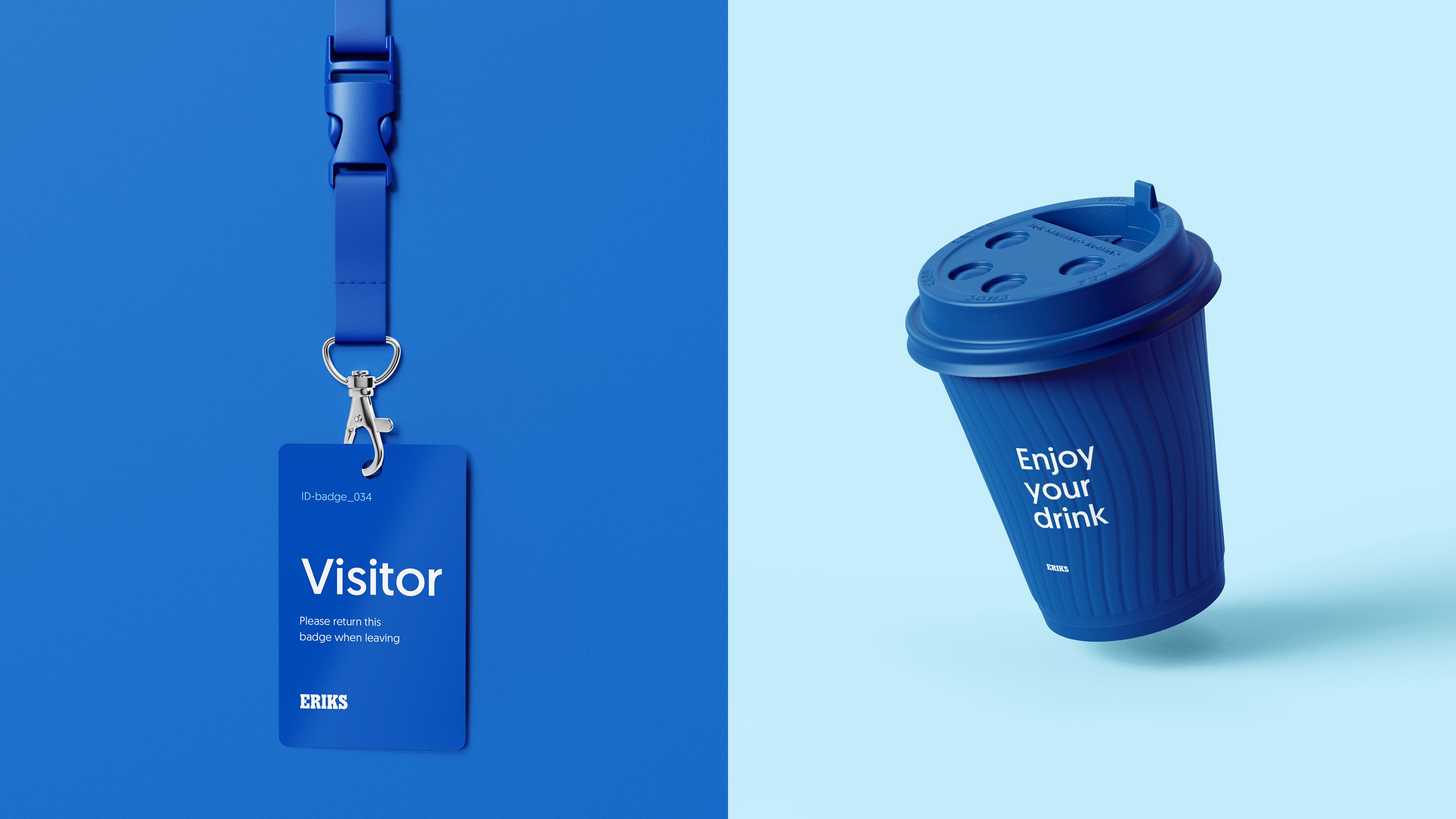
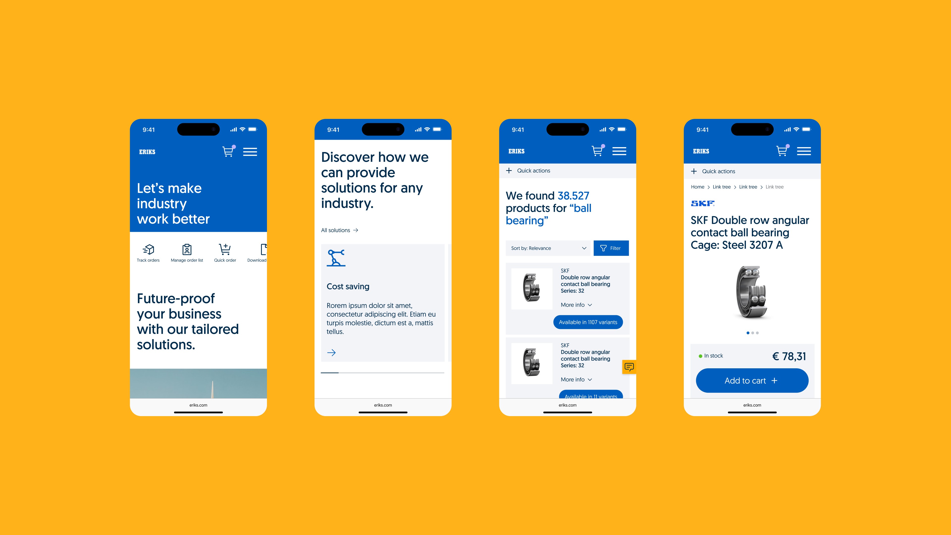
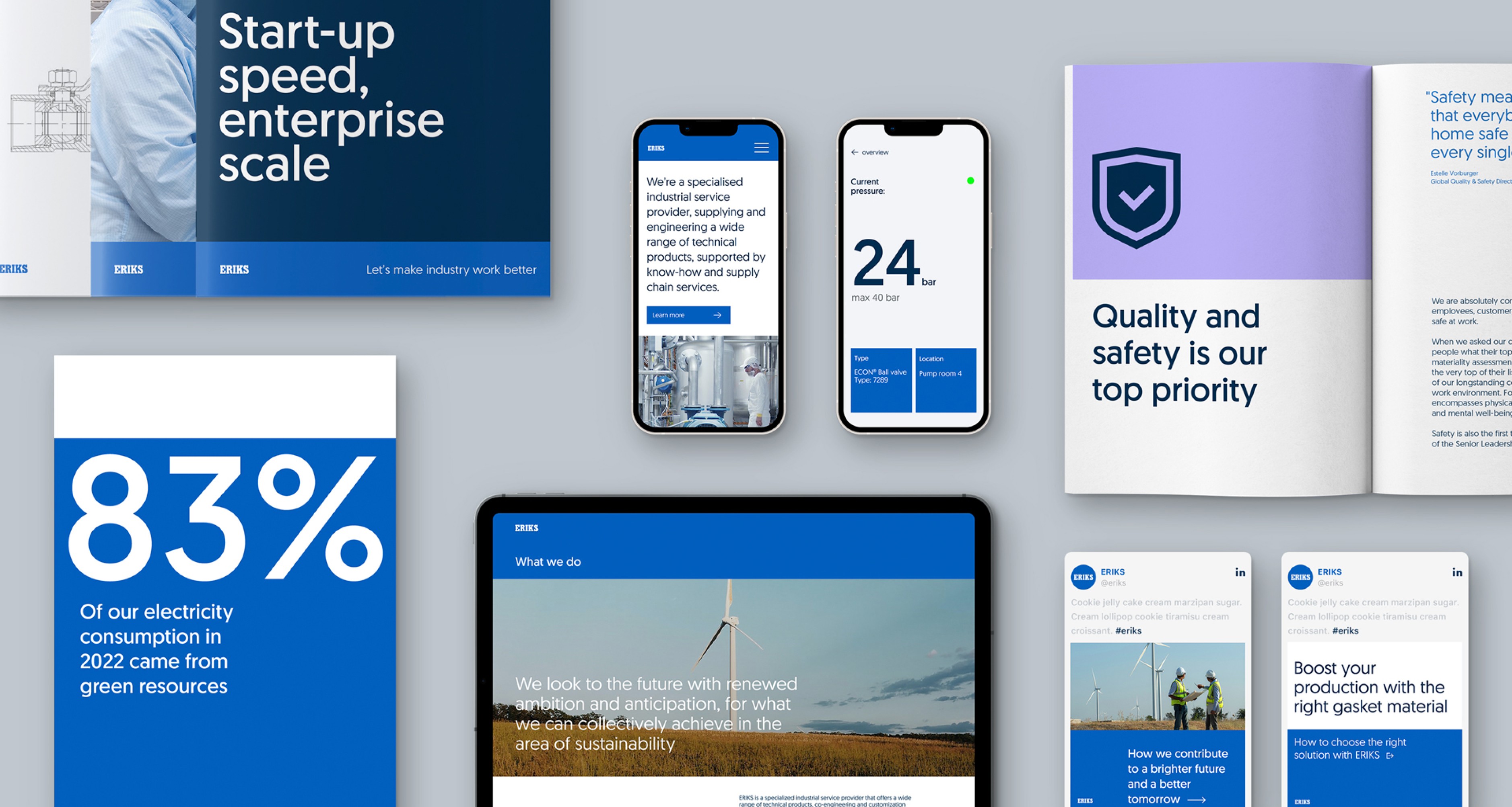
ERIKS, an industrial service provider, was undergoing a brand transformation to better reflect its expertise and modern capabilities. One of the key challenges was translating this new direction into a practical, scalable design system that could support a wide range of digital applications. Without losing sight of clarity, usability, or brand consistency. With a large, content-heavy platform and diverse stakeholders, the system needed to be both structured and flexible.
The outcome was a comprehensive digital brand book and design system that extended beyond just components. It captured new experience principles and a design philosophy to guide how ERIKS presents itself digitally. This toolkit not only ensured visual and functional consistency but also helped internal teams understand how to live the brand through digital touchpoints. It provided both structure and inspiration, enabling ERIKS to deliver a stronger, more cohesive brand experience across all platforms.
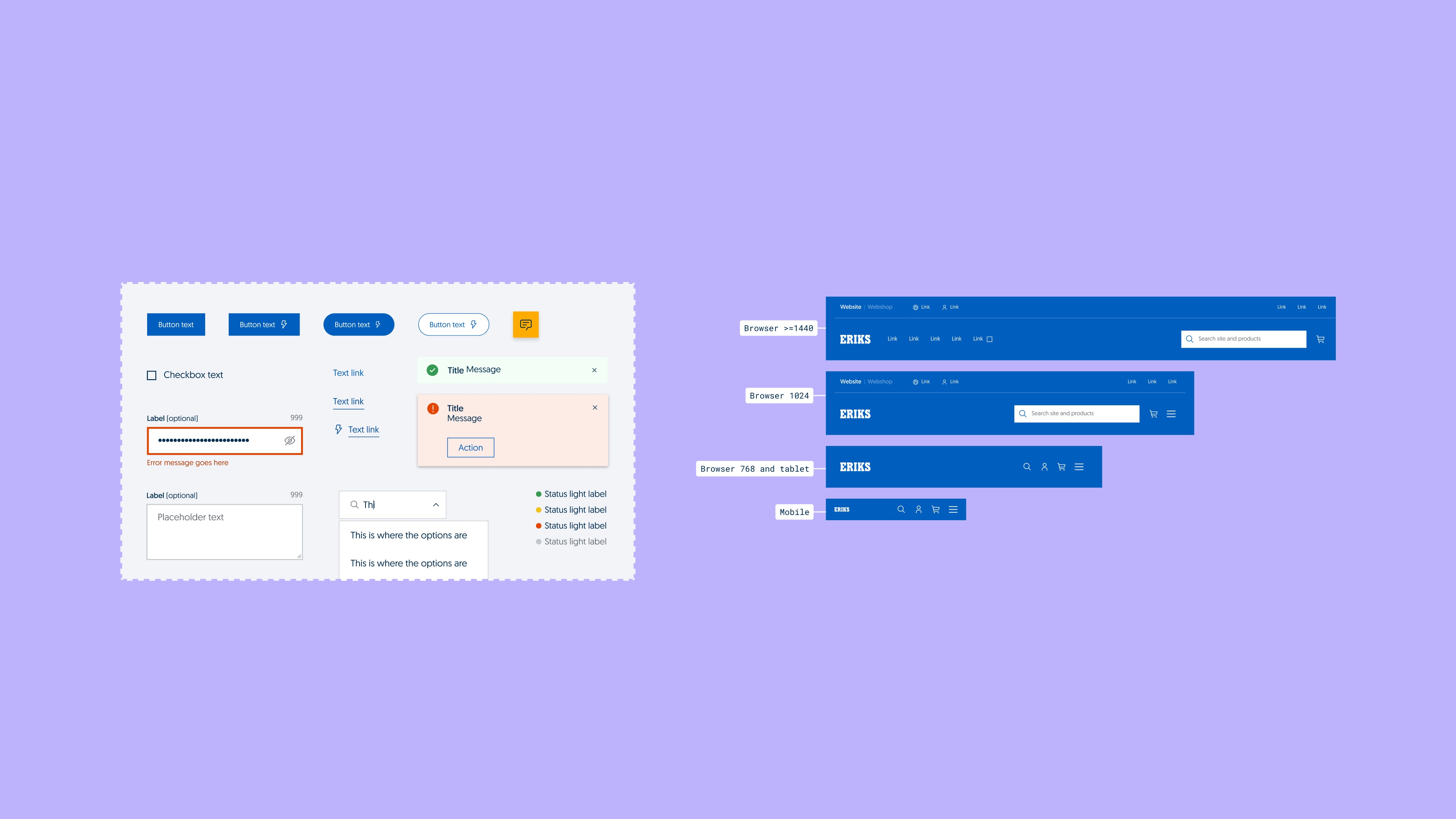
As ERIKS moved into a new phase with their rebranding, the challenge was to translate the refreshed identity into a usable and scalable digital system. Our team worked closely with both brand and development teams to define how the new visual language should behave across interfaces. We made decisions around layout, spacing, color use, and interaction patterns, always balancing brand personality with usability. Throughout the process, we focused on creating something practical, but also something that truly reflected ERIKS’ ambition to modernise.
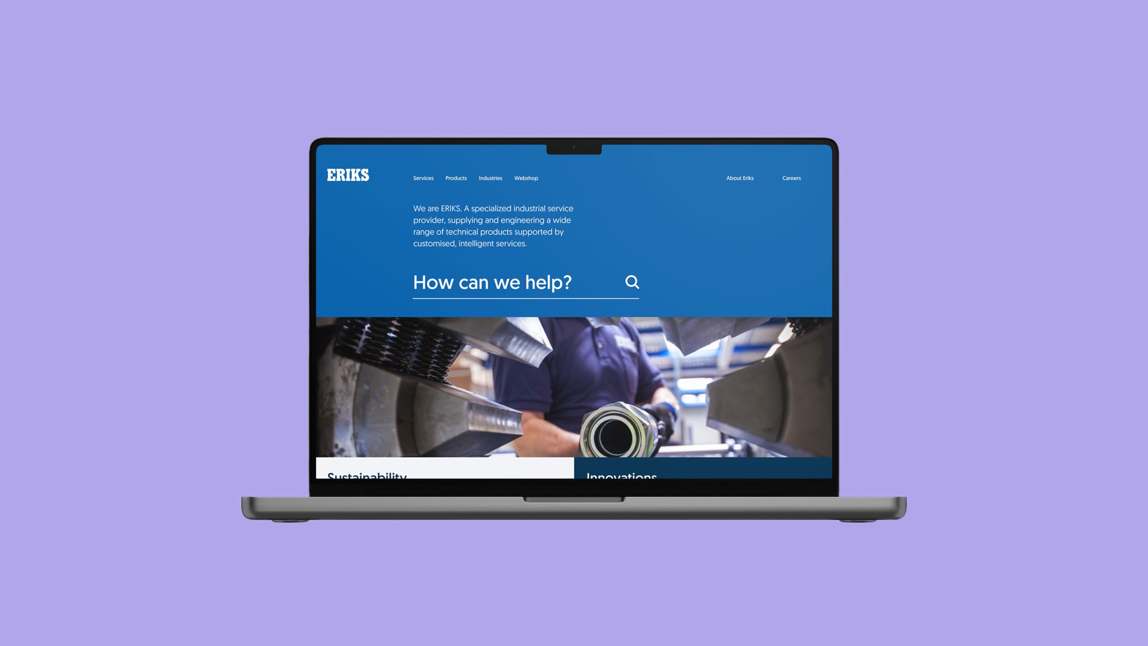
I was responsible for the visual design implementation within the digital design system. Together with my visual design colleagues and art director, I helped define and document UI components, page layouts, and design patterns. I also supported the alignment between the design system and the digital brand book, contributing input on how experience principles and visual direction could be applied consistently. My focus was on ensuring every element felt intentional, functional, and in line with the brand’s evolving identity.