Year
2023
Client
SPAR
Category
Brand Identity
Product Duration
3 - 4 Weeks
The main challenge was to develop a sub-brand that felt clearly part of the SPAR family, while also standing confidently on its own within a B2B, media-focused context. The existing SPAR identity was consumer-oriented and lacked the flexibility needed for digital advertising propositions. I had to find a visual language that bridged the gap—recognizable enough to feel connected, yet distinct enough to speak to advertisers and partners in a professional, media-savvy tone.
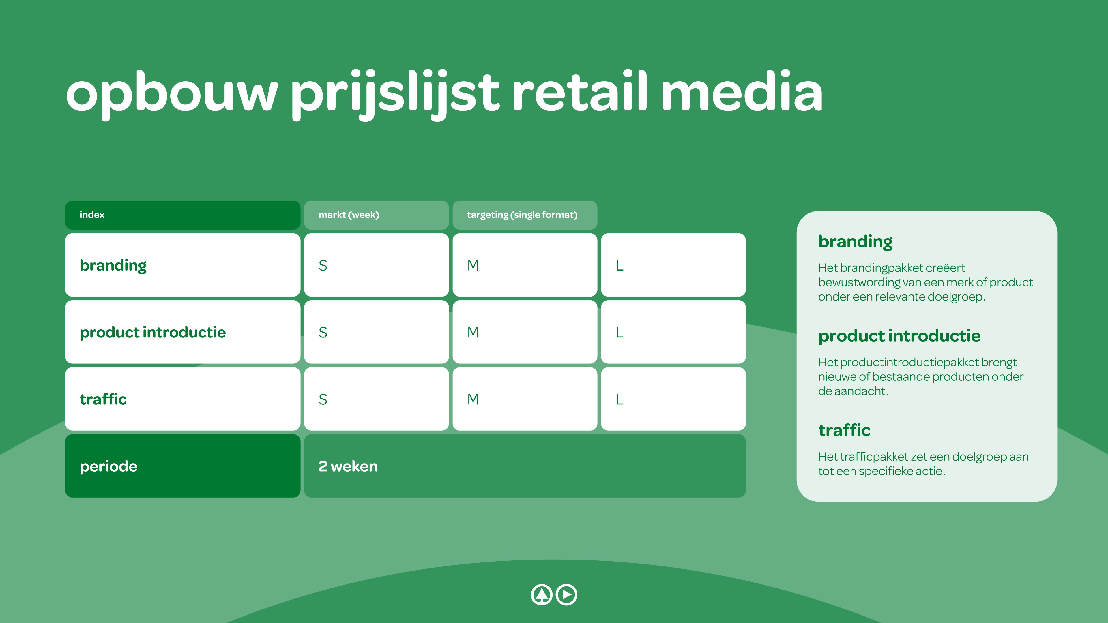
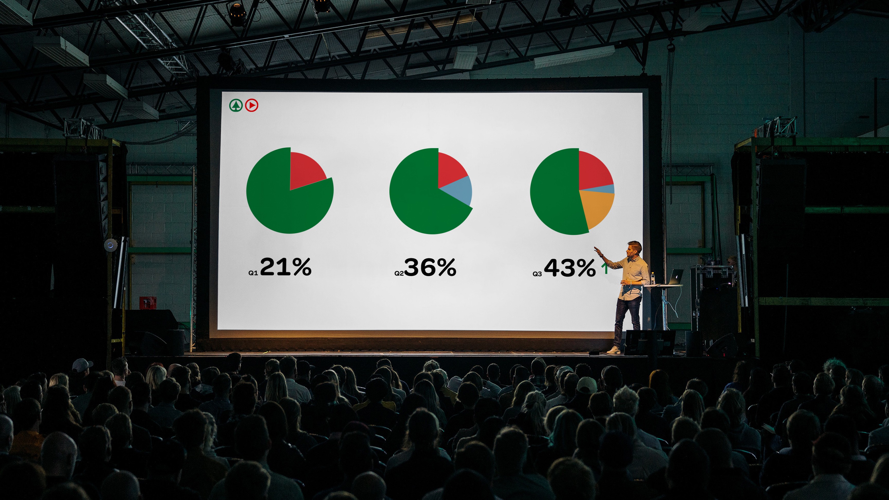
The outcome was a clean, modern identity for SPAR Media that extended the core SPAR brand into a new space without losing its DNA. The brand book I created provided clear, usable guidelines for applying the identity across digital screens, internal presentations, and advertiser-facing materials. It gave the SPAR team a strong visual foundation to confidently present their retail media proposition; internally, to partners, and on the shop floor.
To define the right tone for SPAR Media, I began with research into how other retail and supermarket brands approach their media propositions. I categorized the strategies into three directions: simple and straightforward, bold and outspoken, and subtle and clever. After evaluating these in context of SPAR’s brand personality and retail environment, I proposed a direction that leaned into subtle and clever—leveraging familiar brand elements in a more refined, media-savvy way.
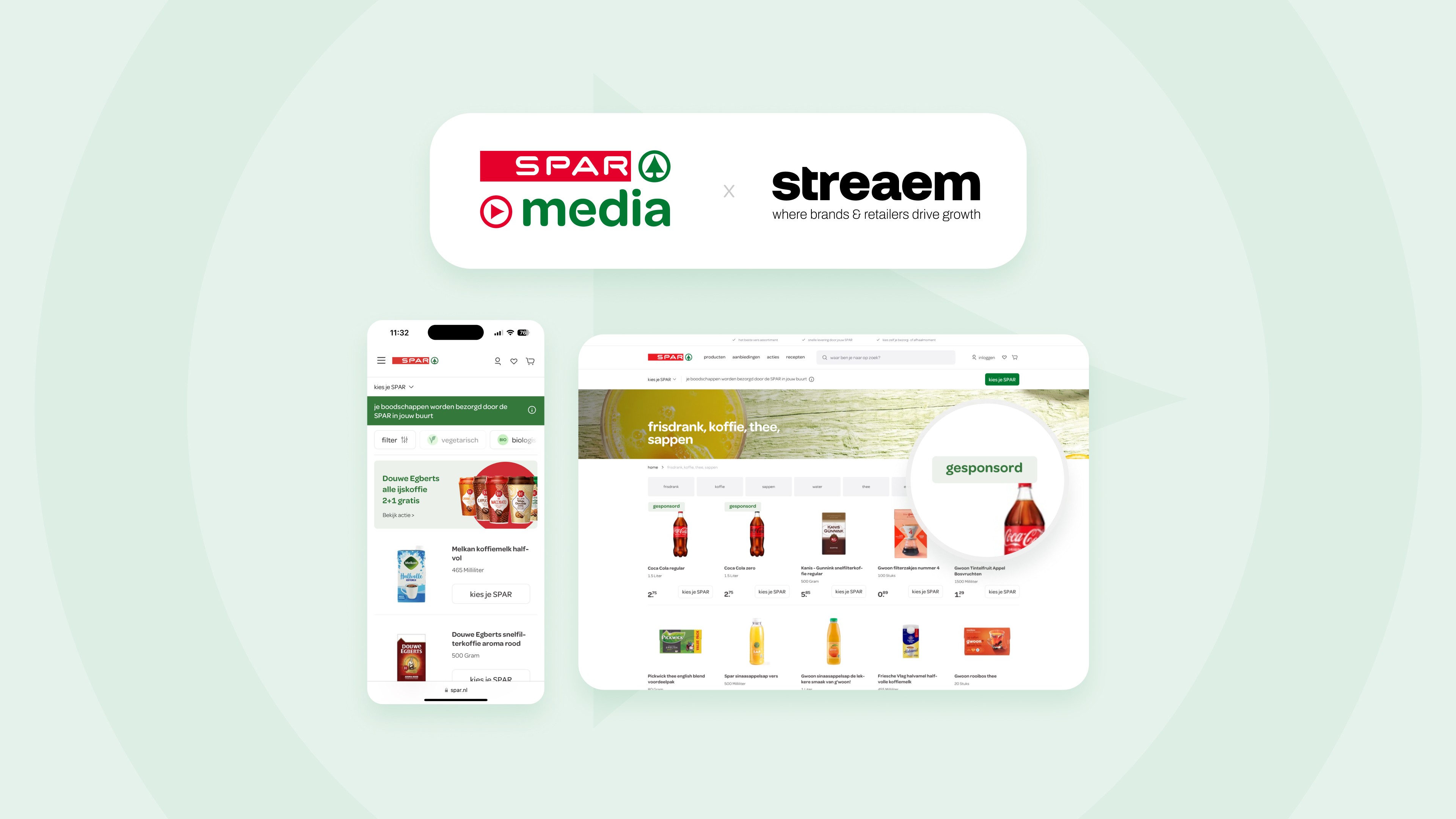
To bring this vision to life and guide discussions, I created stylescapes and mockups that visualized the sub-brand in real-world applications, such as digital screens, presentations, and in-store placements. This helped keep stakeholders aligned and allowed me to clearly communicate the rationale behind each design decision, ultimately building confidence in the chosen direction.
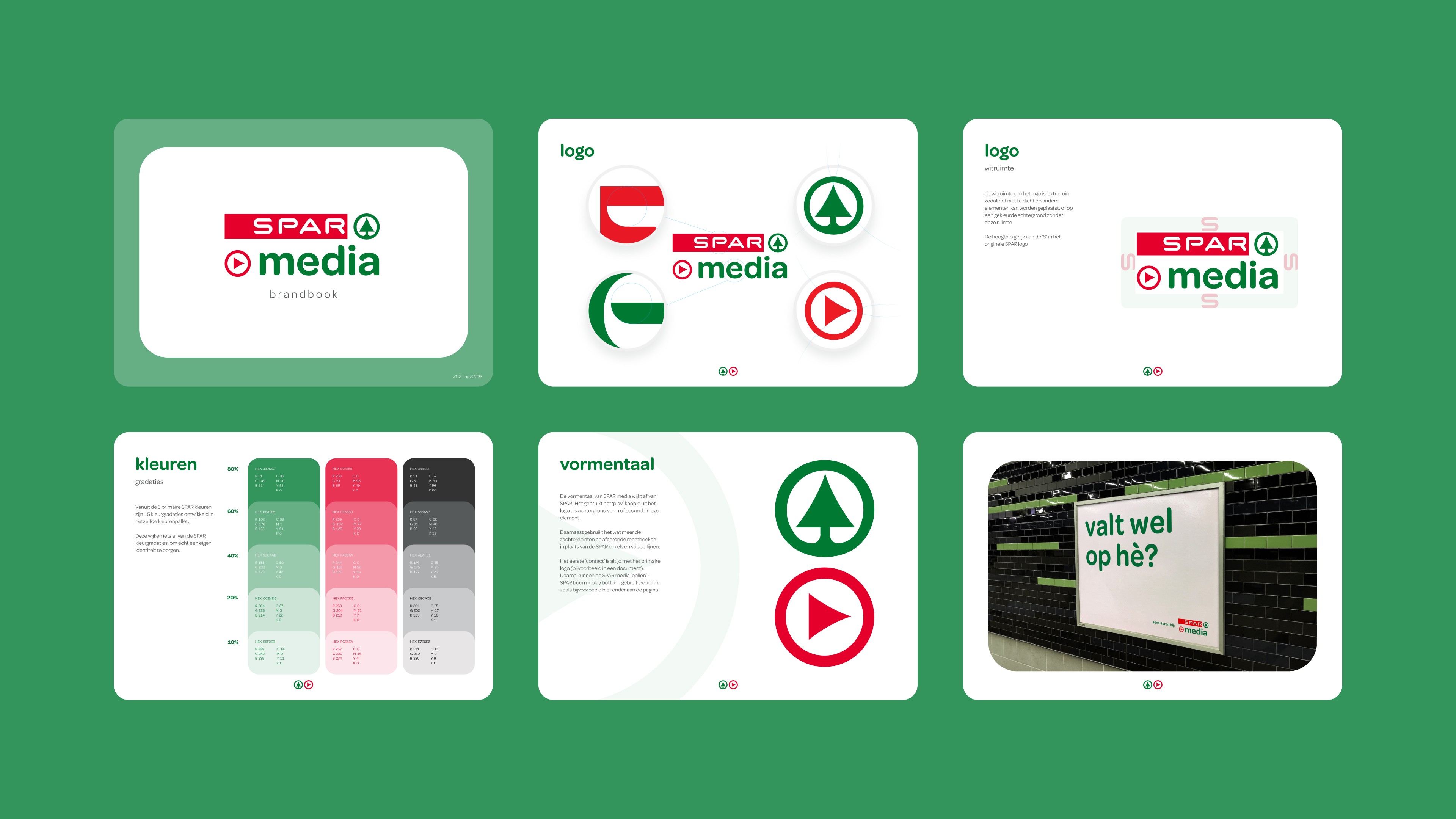
I led the visual design for the SPAR Media brand, creating a complete identity system and brand book from scratch. This included defining logo use, typography, color gradations, layout styles, and a unique visual language that extended the SPAR brand in a subtle but distinct way. I introduced new elements: the play button motif and rounded shapes, to reflect the digital and media-forward nature of the sub-brand. The final result helped position SPAR Media as a professional, cohesive offering for advertisers, while staying true to the recognisable SPAR identity.